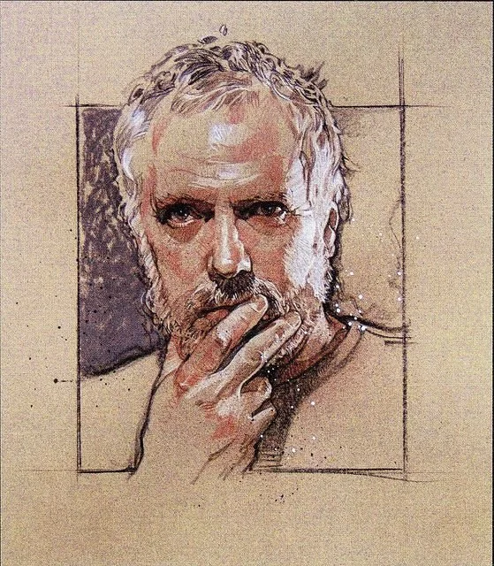
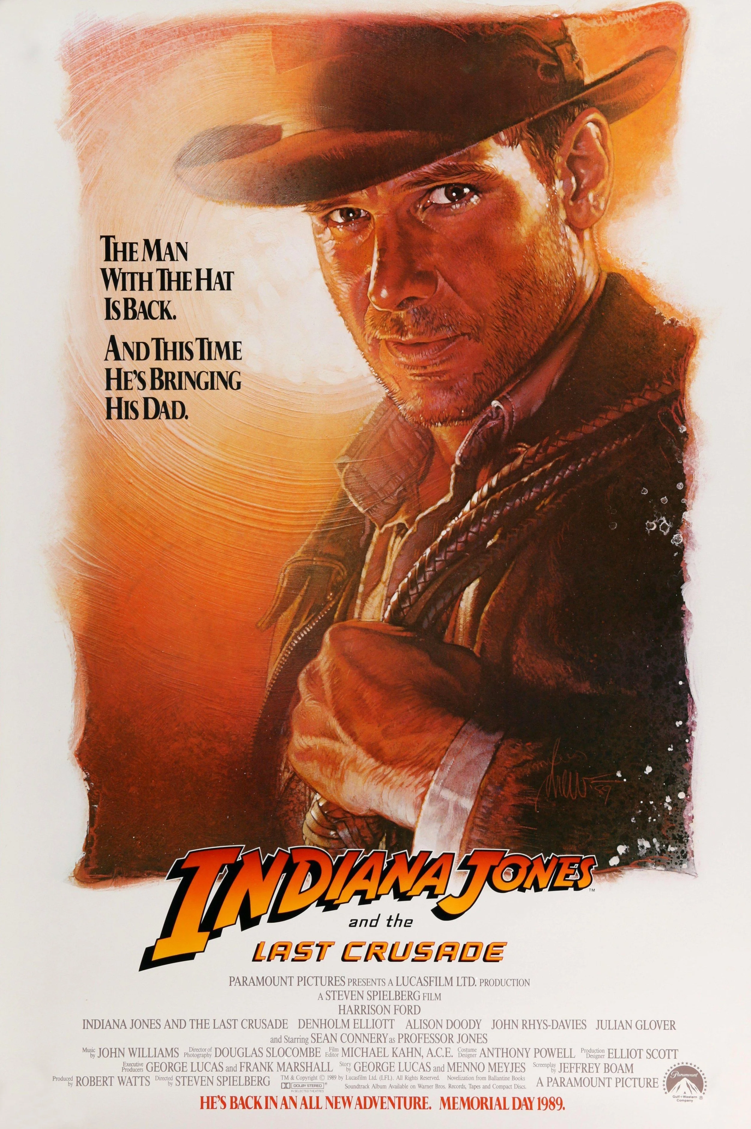
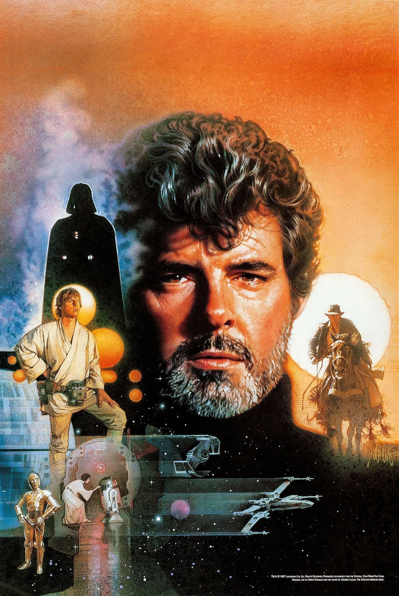
Sit back, and enjoy this rare, almost fireside chat amongst some of the finest illustrators in the film poster field from the last 50 years!
Art of The Neverending Story
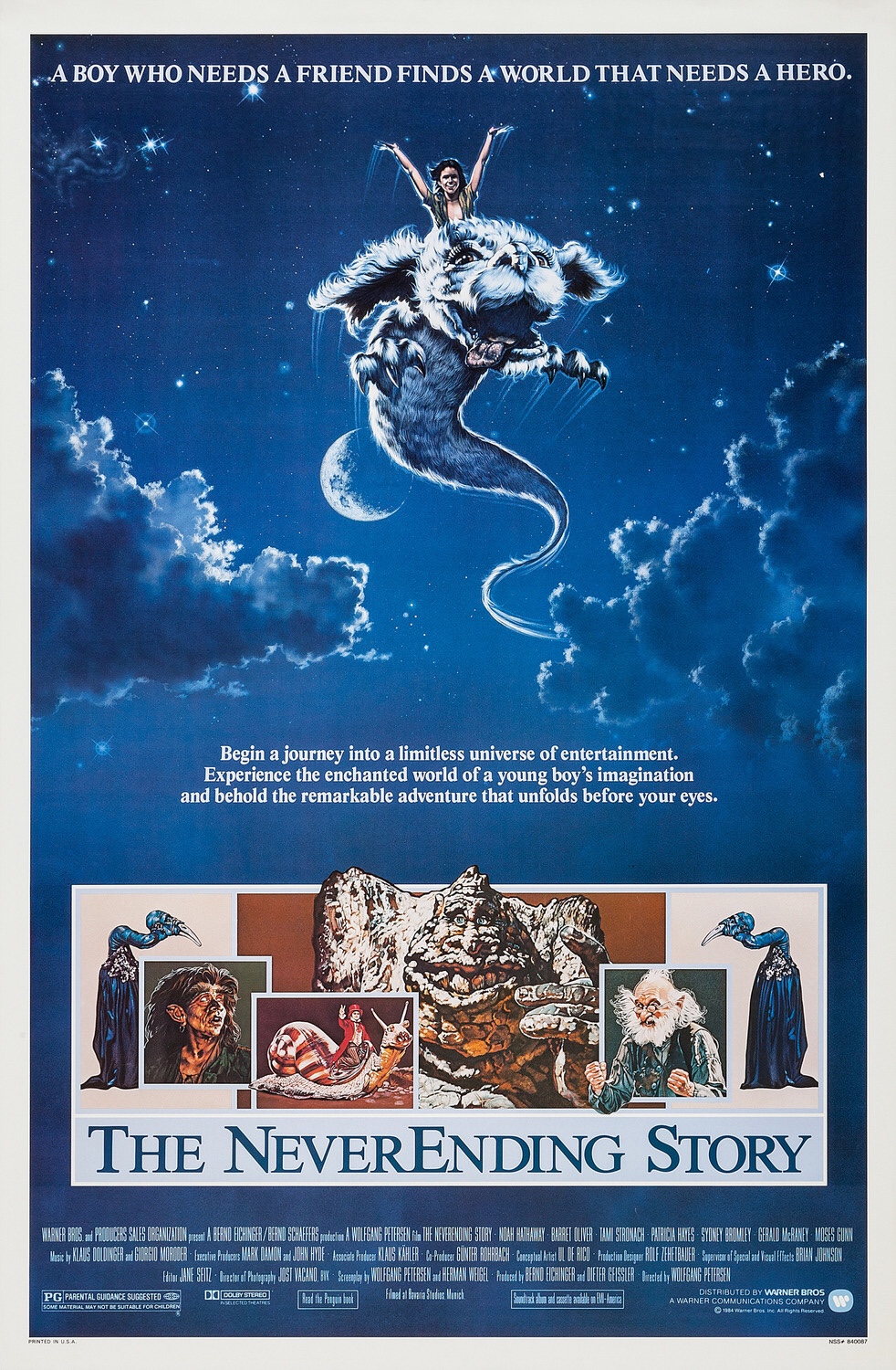
Every time it comes for me to sit down and reflect on movies and movie poster art I hesitate before glancing overwhelmingly within my mind over so many movies and memories. But, I quickly think of movie poster art and find my hasty browse slow to a reflective gradual halt. In this instance, my focus soon stopped and reflected on the image of Falkor, a mythical Luck Dragon from The Neverending Story.
Based on the novel by Michael Ende, The Neverending Story (1984) promised a tale of fantasy. Directed by Wolfgang Petersen, the German production was mainly filmed in Munich, and, at the time, was the most expensive film outside of US production. The cast included Noah Hathaway (Atreyu), Barret Oliver (Bastian), Tami Stronach (Empress), Patricia Hayes (Urgl), Sydney Bromley (Engywook), Gerald McRaney (Mr. Bux), Moses Gunn (Cairon), Alan Oppenheimer (Falkor), Deep Roy and many others.
Artist and illustrator Richard Hescox created The Neverending Story’s illustrated one sheet movie poster that would grace the cinemas and frame many childhoods. The flying Falkor and Atreyu are painting soaring amongst the clouds with fellow cast members lining the bottom suggesting an epic and fantasy driven adventure. A traditional artist, Richard Hescox has worked on other entertainment campaigns such as E.T., The Dark Crystal and illustrations for a series of George R.R. Martin’s Game of Thrones. He continues to make original art pieces of imaginative themes and landscapes of fantasy.
In an October 13, 2013 interview with TheOriginalVanGoghsEarAnthology, Richard Hescox spoke about his art, inspiration and philosophies of illustrating where he reflects on the question of art as a powerful force:
“I like to think of art (all branches: literature, poetry, song, drama, music, sculpture, painting, etc…) as Hyper communication. Talking is basic communication. But make those words a poem and the concept embeds itself far more effectively in the listener. Graphic arts do the same. A talented artist can communicate a concept more subtly, and at the same time more powerfully to the viewer. The mark of good art is the amount and quality of communication that it effects (a test that too much modern art fails at).” -Richard Hescox (Interview 2013, TheOriginalVanGoghsEarAnthology)
Though the author of the original novel The Neverending Story felt that the movie did not reflect his book in its entirety, it has, nonetheless, made an impact over the many decades since its release 35 years ago. In 1990 my 2nd grade teacher scheduled a movie day at school where we could bring a sleeping bag and watch a movie, and on this occasion it was The Neverending Story. This one moment was instantly enmeshed with the events around me that year, friends, moving, changing schools twice and the magic of Falkor. The art of film and movie posters are powerful forces. The importance of the illustrated movie poster is the imaginative power of the artist and relaying this to a receptive audience, a freedom to create an image of fantasy and showcase the film in one image. However, it is the impact of their art that can remain impressionable and is often our reference point in memory.
“I feel the most pleasure when I find that a painting I have done, and which I feel a huge aesthetic charge from, has also touched others in unexpected ways. The communication I strive for has to be felt by viewers of my paintings on a deeper than literal level. Therefore I am most excited about creating the next painting that achieves that.” -Richard Hescox (Interview 2013, TheOriginalVanGoghsEarAnthology)
Movies & Memories: Going behind the scenes with the ‘art’ of illustration blog
The former Paul Shipper Art blog has returned! As a features blog, it will take a behind the scenes look at the entertainment industry through the art of illustration. We aim to bring you a unique perspective from the art world, and to keep you informed about entertainment news, appearances and events surrounding the artists of film poster illustration and their work. Leading on from this mission, my first task as the features writer is to introduce you to the face behind the words, and it is here that I will attempt it through my experiences of the entertainment industry and a couple of movies that stood out in my childhood highlighting the work of Bob Peak (Excalibur) and Carl Ramsey (Poltergeist).
Growing up in the US in the 80s and 90s, I was inspired by the characters from adventurous plots and mysterious storylines swathed in the enchanting sets of cinema. These films, though not always historically accurate, were full of mystery, adventure, the supernatural and a dash of horror. They made an indelible mark on my inquisitive mind and led me on a sure path to examine ancient mythology. The allure that cinema had encouraged me to examine history on a much deeper level and forgave the historical tangles and (mis)representations that it portrayed. Movies for me, as a child, went hand in hand with their visual and iconic artwork that appeared on their VHS cassette boxes and posters in the local video stores. I rarely went to the cinema growing up, so I understood the long duration of wait time between the big screen release in the cinemas to its arrival at the local video rental store. A high box office earner at a video store would claim an entire wall display and I can recall on many visits there would be ‘no rental copy available’ disappointment. In the event of this, I would examine the shelf video box scanning over its front cover art and (re)reading the movie synopsis on its reverse. Sometimes a video store clerk would just happen to return a top title back on the shelf and I would be there at the right time!
My family are comic-book fans which encouraged my imagination to paint a world around me where anything was possible. I was often outside playing superheroes and ‘fake fighting’ either as Storm, Kitty Pryde or as my own created comic-book character Deadly Princess Kelee to defeat those invisible bad guys. Whether I was performing family comedy skits, or digging for creepy crawlies and catching lightening bugs, it was rare that a weekend would go past that I wasn’t sitting in front of the television enjoying a daytime episode of Star Trek, I Love Lucy, The Munsters or one of the many classic television reruns.
Some of my fondest memories were of my mom rushing to make a massive bowl of popcorn before Doctor Who began, an entertainment family tradition. Like many, the tradition of television and movies wove itself into my family’s everyday life. Two movies stand out instantly in my recollection when I think of family tradition and the 1980s, Excalibur and Poltergeist.
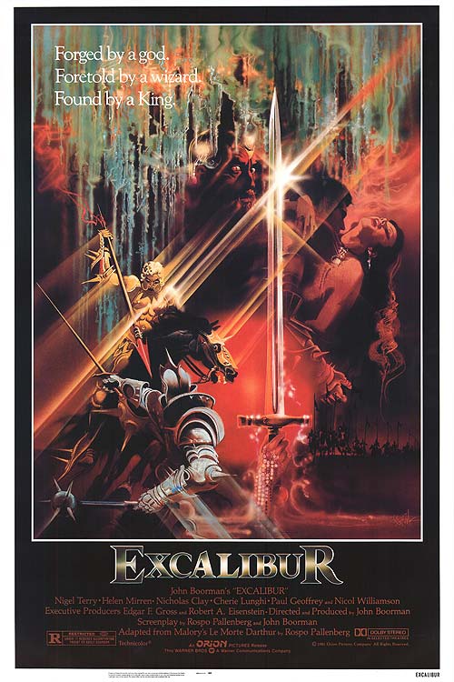
“Behold Excalibur! The sword of power! Forged when birds and beasts and flower were One with Man, and death was but a dream!” - Merlin (Excalibur, 1981)
The 1981 film Excalibur was a tale of King Arthur that combined an element of grit with enchantment, exemplifying how betrayal and drama surrounds any tale of epic proportions. My first striking memory of this movie was Bob Peak’s movie art on our VHS box. It was in the late 80s/early 90s when I remember looking at the fairytale-like enchantment of the light and colours. The arm of the Lady of the Lake and the glinting light reflecting off of the sword in Bob Peak’s art is just as enchanting as the scene in movie. Comparatively, the film was a less misty-eyed version of King Arthur to what you might have read or watched as a child. O Fortuna, the theme of King Arthur’s ride will always be synonymous with this moment. I remember watching Nicol Williamson’s performance as Merlin, each word would rise and fall in every scene, you could not help but share in the sense of being scolded alongside the characters that he spoke to. Helen Mirren was that day forward known as Morgana in my mind and Nicol Williamson as Merlin. This movie swirled a fantastical vision of mythology with a realistic tone. The film made the mystical seem less dreamlike and more a possibility by exhibiting the natural human flaws in personal choice and consequences.
From historical mythology to modern phenomena, the 1982 movie Poltergeist depicted paranormal experiences coming to life where a family draws on their own bond and strength to overcome the unusual events that befall around them. There was a slight documentary feel, not too unlike Close Encounters, which saw the development of paranormal activity through the family’s day to day routine. The name Carol Anne was often uttered in my household followed by warnings of not to go into the light. A snowy television screen often prompted a quote or two from the movie, an iconic image captured by the movie poster by Carl Ramsey. I was both scared and in awe of Poltergeist.
“There is no death. It is only a transition to a different sphere of consciousness.” - Tangina (Poltergeist, 1982)
Poltergeist is a family classic which only added to our shared tales about phenomena and ghost stories. This movie gave me a sense of how a strong bond can guide you through the most complex of situations, it is just a matter of knowing when to stay away from and when to walk towards the light.
Television, movies and its accompanied artwork has made such a strong impression on me as an individual. It is our experiences through the arts that help us identify our interests and even our prospective career path. I welcome you to this new blog series and I look forward to sharing more Movies & Memories with you in the coming weeks.
-Kelee Siat
Good Milo!
An exciting update to the news that the poster I illustrated for the film 'Bad Milo' was nominated and a finalist at this years Key Art Awards....Well I am proud to tell you that It won a Silver Key Art Award in the Illustration Category/Print technique!
Being a huge fan of film posters and movie advertising I have followed the Key Art Awards for many years - What an amazing feeling to have a poster I worked on make it to the awards and win!
Thank you so much to Gravillis Inc. who I worked with on the poster for entering the poster this year. Thanks also to the Hollywood Reporter and the Key Art Awards! It was an awesome night... Not only did we get an award but illustration Legend and Mentor, Drew Struzan was honoured with a Saul Bass Award for his contribution to the craft... Wish I could have been there!
Key Art Awards / Bad Milo
I heard some exciting news this morning and I wanted to share it with you all. The poster I worked on with Kenny Gravillis for Jacob Vaughan's film Bad Milo has made the final selection at the Key Art Awards in the category of Print Technique for Illustration...
It was really wonderful being able to catch up with Director Jacob Vaughan during a trip to LA last year... a truly awesome guy!
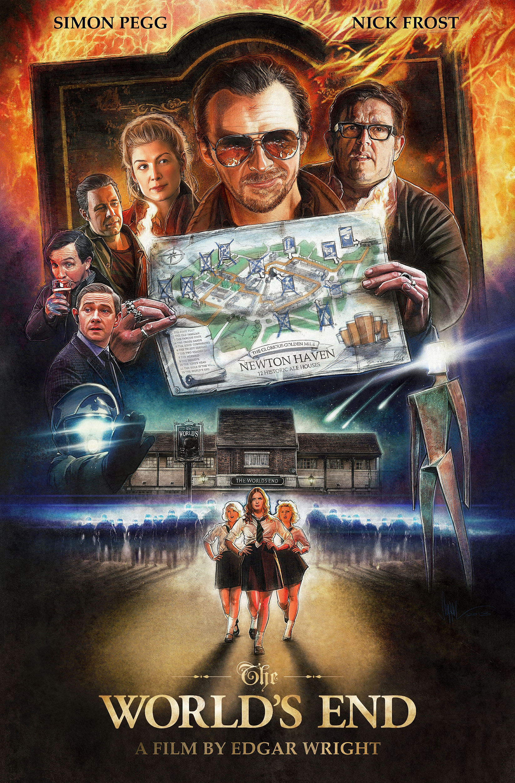
The World's End - An Illustrated Film Poster
Okay, being followed on Twitter by a celebrity you admire is one thing... but when they send you a direct message asking if you would be interested in creating a piece of art for them... well, that's... SUPER cool!
Simon Pegg was very generous in publicly liking and tweeting my Star Trek poster art earlier last year to his fans and since then we have kept in touch with each other from time to time, culminating in an unexpected commission from him to create an illustrated poster for his latest film 'The Worlds End'!
Simon wanted me to see the film before I started on the poster design. His assistant invited me to a screening that would be in Wellington a few weeks away... a press screening I presumed...I was planning on going, until I realised the mid term school holidays were to start that weekend -- The film would be out the following week here so decided I would wait a week and spend some quality time with my daughter that weekend.
The day before the screening, Simon Tweeted this:
Bloody Hell! Simon and the Cornetto Crew were on their way to New Zealand! - Turns out it's the NZ Premiere I've been invited to! ....and there was no way I could get down to Wellington in time... Martin Freeman and Benedict Cumberbatch (at the time I was drawing him for the Star Trek: Khan comic book covers) were there too as they were filming the Hobbit... oh and look, Edgar Wright and Peter Jackson! (After telling a good mate this story, he called me a fool. Hah, I sure felt like one!)
After getting over the fact that I had been invited to the New Zealand Premiere and NOT gone! I went to see the film the following week and absolutely LOVED it! Now the ideas for the poster began....
Once I had the rough composition sketched out I emailed it to Simon to have a look at...
I got a quick fire reply from Simon by Direct Message on Twitter: (NB. Whenever I receive a message from Simon and I read it, I ALWAYS hear his voice saying it)...
Honestly, I can't ever recall a client messaging me like that before... I totally love this guy!
With no major changes needed except for adding Simon and Nick's names at the top of the poster and adding 'A Film by Edgar Wright' under the main title, Simon was completely happy with how the poster looked and gave the go ahead to work on the final art...
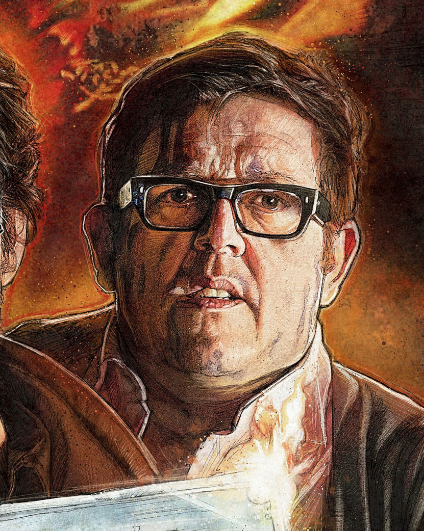
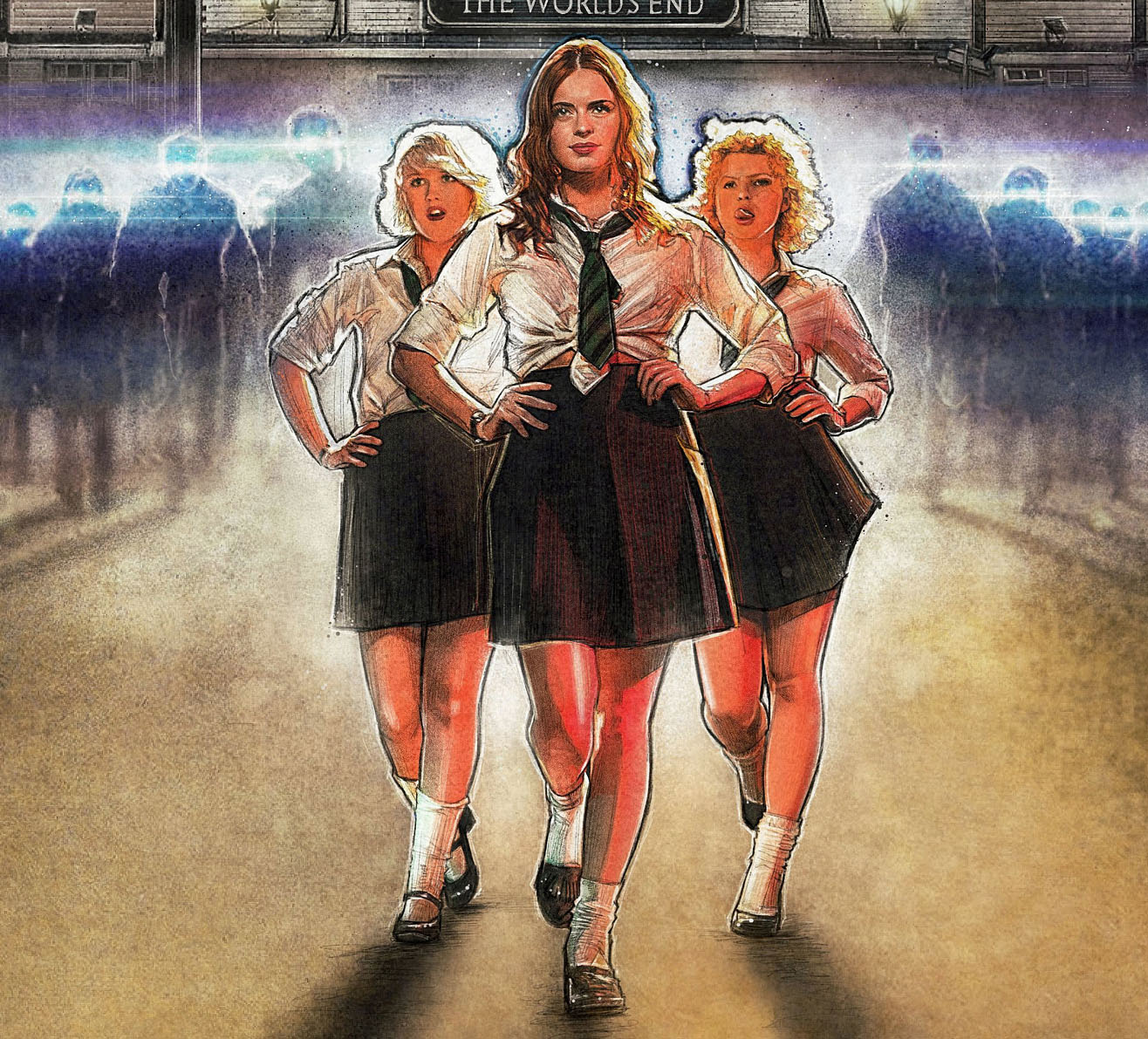
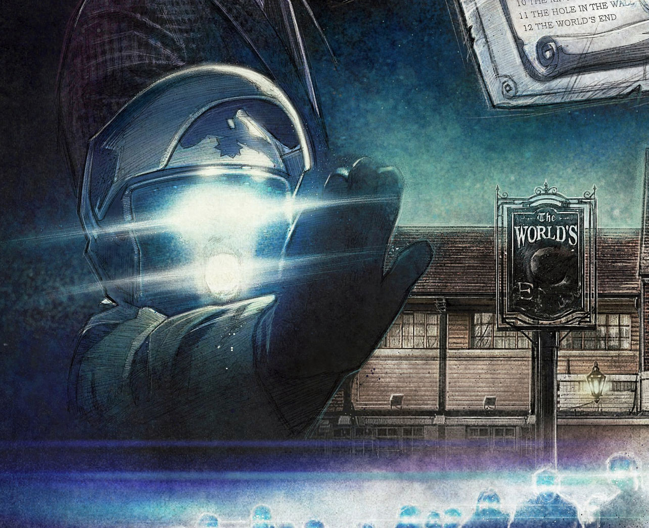
And here it is:
Edgar Wright, Director of 'The World's End' was kind enough to write to me recently recalling the moment he received his gift:
A Poster Artist can not ask for higher praise than that! Thanks to you Edgar for taking the time to write to me and to Simon... well, this was all your idea!
An honour and a pleasure creating this illustrated 'World's End' film poster for you... You're a true Gentleman and a Living Legend mate!
Should you so desire, here's a link to download a 2560x1440 version for your desktop wallpaper.
Journey to the West - Illustrated One Sheet
When I first watched the trailer for Stephen Chow's latest film I thought, Woah! it reminds me of a show I grew up with in the UK... 'Monkey Magic'... As I researched a little more, turns out that this film by Stephen Chow (Kung Fu Hustle, Shaolin Soccer) is based on the same material! Very Crazy Cool... The film looks as crazy, if not more so than the TV show I was so fond of as a kid...
It is an absolute pleasure to be asked to illustrate a poster to promote this film for Magnolia Pictures and Magnet. This is another film that thematically lends itself to this kind of 'old school' advertising, my favourite kind!
It is so awesome to see a company looking towards illustrated posters to promote their films and feel very fortunate and proud to be a part of it…
The Poster art made its debut on CraveOnline and has had some nice feedback...
About the Film:
Based on one of the Four Great Classical Novels of Chinese literature of the same name, Stephen Chow's ‘Journey To The West’ is a contemporary remake of the misadventures of a Buddhist monk as he makes a pilgrimage from China to India. - See more at: http://www.magnetreleasing.com/journeytothewest/
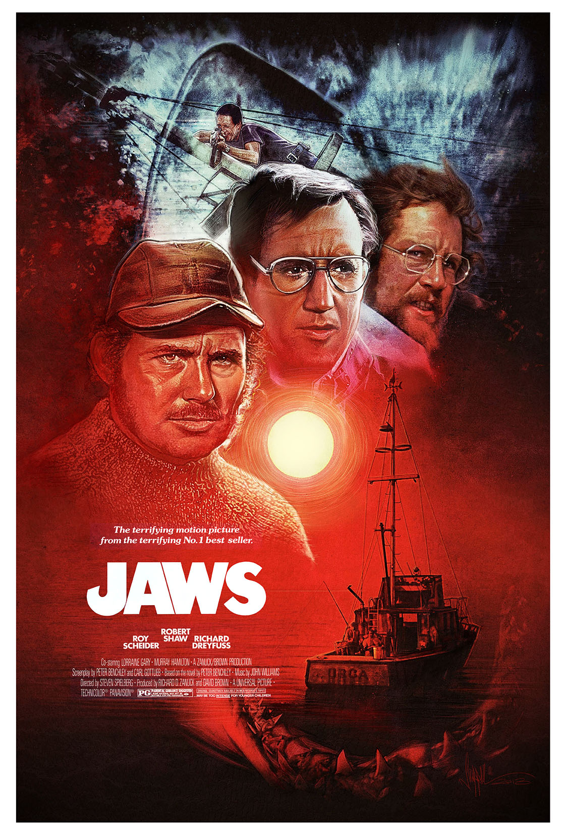
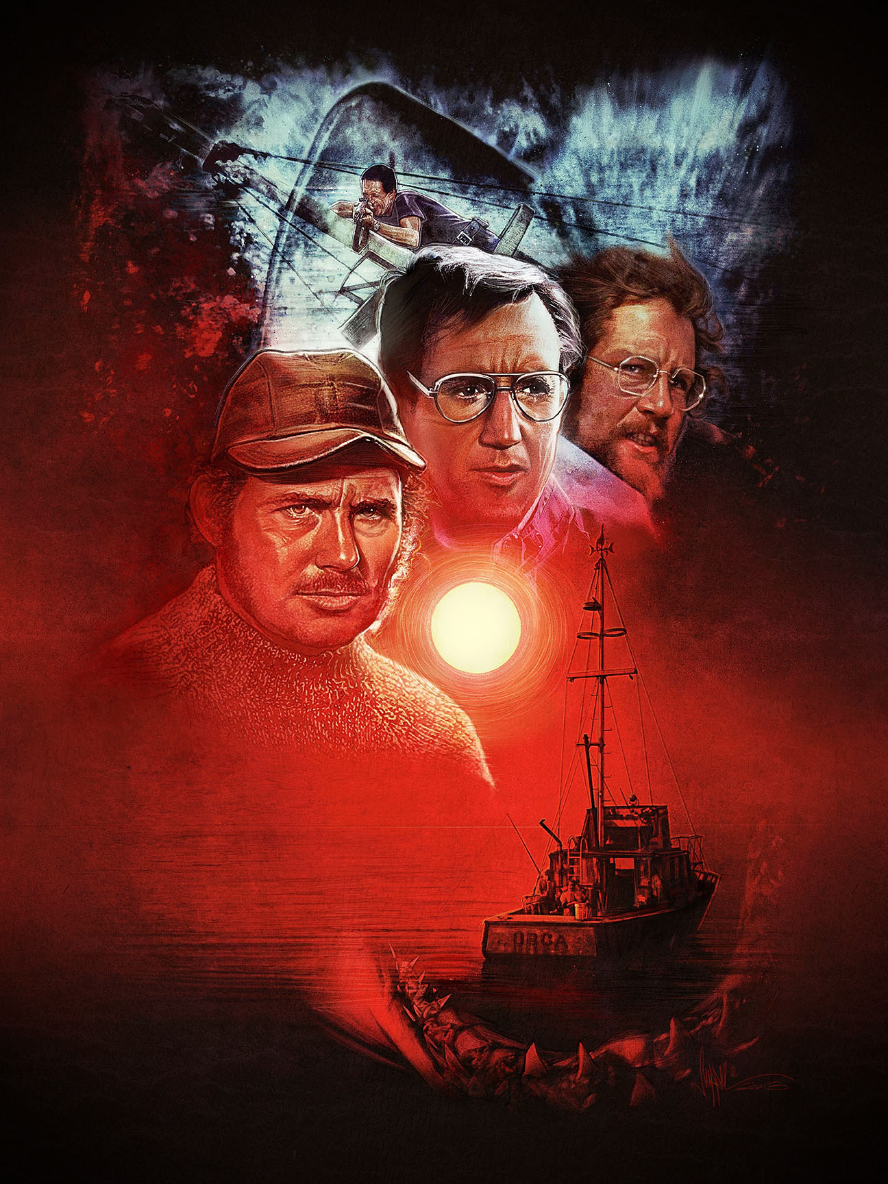
'Out To Sea' - Smile You Son of a Bitch! A JAWS Tribute Art Show
Its on tonight... Time to start swimming with those bow-legged women and check out the amazing art show celebrating Spielberg's Masterpiece this weekend only at Hero Complex Gallery in Los Angeles!
UPDATE: Jaws Prints now available online!
Both limited edition of 100. This weekend only!
PangeaSeed, artist Craig Drake and Hero Complex Gallery present a shark-saving effort of monstrous proportions: Smile, You Son of a Bitch! An Art Tribute.
3 days only, from November 1 – 3, 2013 at Hero Complex Gallery in Los, Angeles.
This unique ARTivism effort will featuring original artworks from over 90 international artists all coming together to help raise awareness for the global plight of sharks while celebrating their place in pop culture.
Opening Reception:
Friday, November 1 – from 6-10pm
$10 donation at the door – proceeds go directly to benefit PangeaSeed’s conservation & education efforts and help the non-profit organization stay afloat.
For more information please visit: PangeaSeed.org / HeroComplexGallery.com
Event address:
Hero Complex Gallery – 2020 South Robertson BLVD. Studio D. Los Angeles, California 90034
Check out the show reviews over at
Trailers From Hell
http://trailersfromhell.com/shark-attack-hero-complex-gallery/
and
Ain't It Cool News!
http://www.aintitcool.com/node/64945
Bad Milo - One Sheet Illustration
Just announced: Film Poster/One Sheet I illustrated for the film Bad Milo.
Exclusively premiered on BloodyDisgusting.com today:
And picked up by Ain't It Cool News!
Some really nice words on the poster design from both of these sites - Thanks so much guys - pleased you dig it!
Kudos to Gravillis Inc great working with them again.
Twitter message from Writer/Director Jacob Vaughan
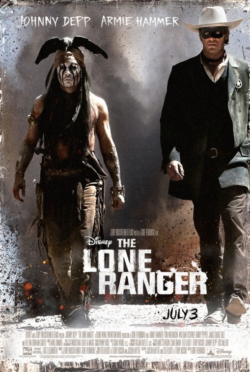
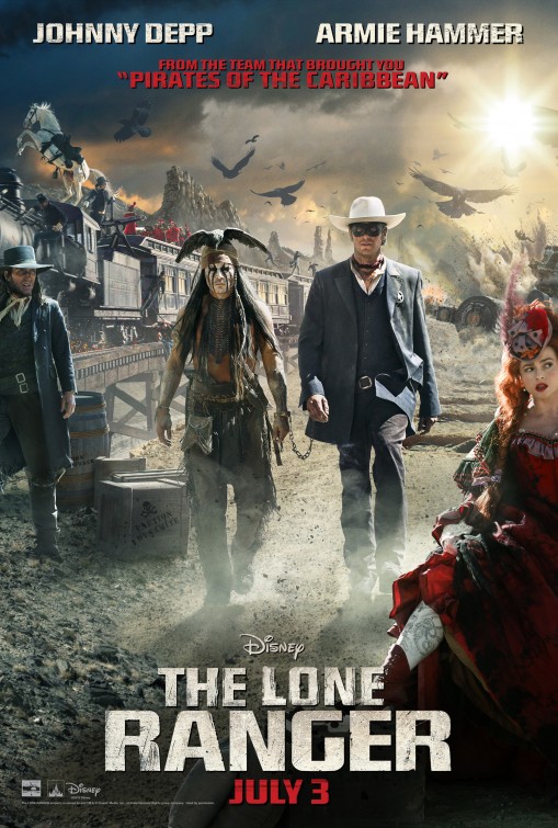
The Lone Ranger - Illustrated Fan Poster
When I first heard about Disney's Lone Ranger movie coming out - I thought, what a perfect movie for an illustrated one sheet! I got very excited to see what may come of the official poster...
I felt an opportunity had been missed and so, I decided to create a poster that I thought could be deemed worthy of The Lone Ranger...
I only hope you agree... much like the JJ Abrams Star Trek posters, this is a personal project, just for fun...and for the love of the old movie posters I grew up with.
I'm always listening to music while I work and in particular this track from the Lone Ranger Score by Hans Zimmer really got me pumped while working on the poster...
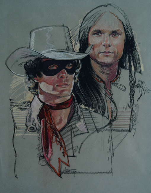
Back in 1981, The Legend of the Lone Ranger quite rightly had an illustrated poster... plus there are some comprehensives that Master Drew Struzan created for the film poster design... and a collectable plate illustration from 1994
Celebrating 'Pacific Rim' with the 'Poster Posse'
Over at Blurppy.com there is something going on - We're celebrating exciting movies we can't wait to see... this time round it's Guillermo Del Toro's Pacific Rim that gets the Poster Posse treatment and there is so much of it that Blurppy had to do two phases.... over 2 days... both of which are now LIVE.
Here's What Blurrpy had to say...
Check out the artwork from over 24 Artists here: Phase One: Phase Two:
Star Trek: Into Darkness Illustrated Poster
Following on from my recent Illustrated poster for JJ Abrams' First 'Trek' film, I am very pleased to announce an illustrated poster design for the latest instalment from Bad Robot and Paramount Pictures, Star Trek: Into Darkness.
Exclusively premiering on Blurppy.com today, this artwork is presented alongside even more 'Into Darkness' inspired alternative movie poster goodness, from some of my talented 'Poster Posse Project' Pals Matt Ferguson, Marko Manev, Marie Bergeron, Adam Rabalais, Rodolfo Reyes, Johnny Dombrowski, Fernando Reza, Tim Anderson and Joe Vetoe.
Illustrated 'Cloud Atlas' Poster Coming Soon
I’m very pleased to announce that I have been asked to create an illustrated ‘Cloud Atlas’ poster!
Just finished a wonderful Skype video meeting with Jon Donahue from BeyondTheMarquee.com where we talked about working on an illustration for this ground-breaking film.
I have to say I’m very excited as it is an absolutely amazing film that they made, and I’m looking forward to the challenge of representing this incredible piece of cinema into a piece of film poster art … An illustrated poster with the aesthetics that will hopefully make you want to see the film all over again. Or, if you missed it, will make you want to see it for the first time!
Who knows where this will go. At the moment it’s a personal project of ours – Jon worked on the film with Tom Hanks and between the cast and crew, they all had an incredible time making this film and this is a chance to celebrate it the way we know how… in the form of a new illustrated poster. Looking forward to the ride!
Iron Man 3
Iron Man 3! Had to, just had to do a little mock up poster illustration! Going to see this tonight. Can't wait!
PS.
UPDATE
Quick review. Spoiler free. Great film. Think, 'Iron Man' meets 'Lethal Weapon 2'. Great action, laughs, emotion, characters... Ben Kingsley is knockout!!! Go see it!
Star Trek - Illustrated Poster Art
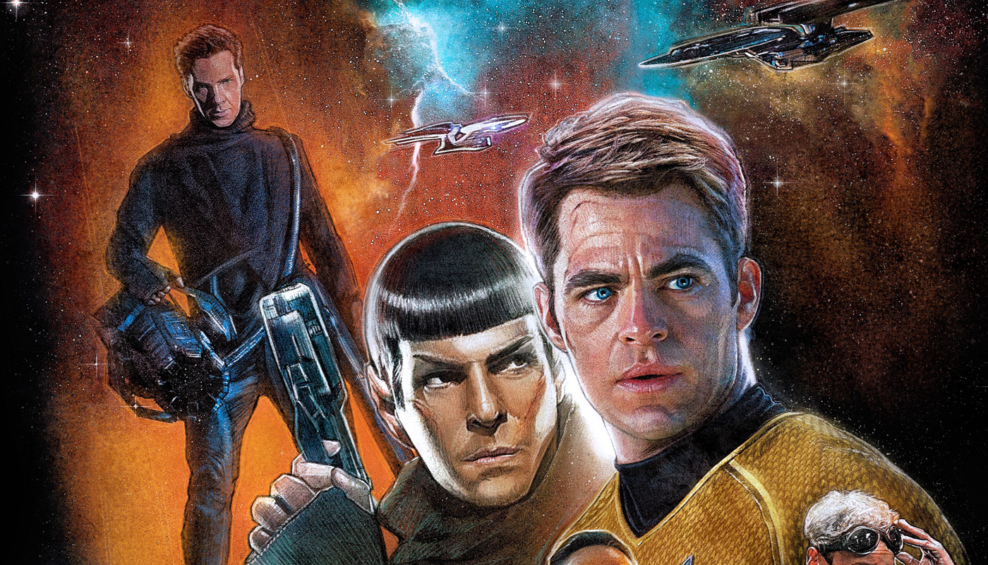
It's Star Trek month over at Planet Pulp and I finally get to illustrate a Trek poster!
I was quite vocal about the film poster campaign when the first JJ Abrams Star Trek was released... and I did say I would have a go at an illustrated version of the poster, well, just as the next instalment of the reborn franchise is upon us, I finally got round to it. Projects dont usually take me 4 years to complete by the way! I actually roughed this out after re-watching the film again last week, comped it up on Friday night, drawing Saturday and Sunday and finishing it after a full day on Monday... so 4 days (not years)
There is a tip of the hat here to Bob Peak's amazing poster illustration for ST:TMP and it felt right to do that to me...also managed to incorporate Nero's drill in there too.
Hope you all like it - Very excited about the next film, 'Into Darkness' maybe a companion poster will emerge?...
JJ Abrams really did a great thing with making this movie, I was kind of into Trek growing up, mainly because it was Sci-Fi (Star Wars was top dog at the time) but JJ Abrams definitely sealed the deal for me when he made this!
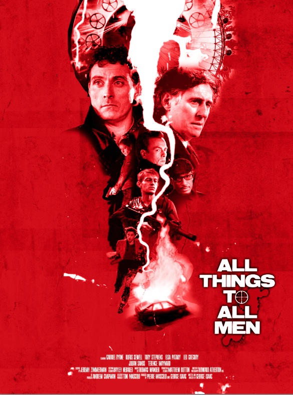
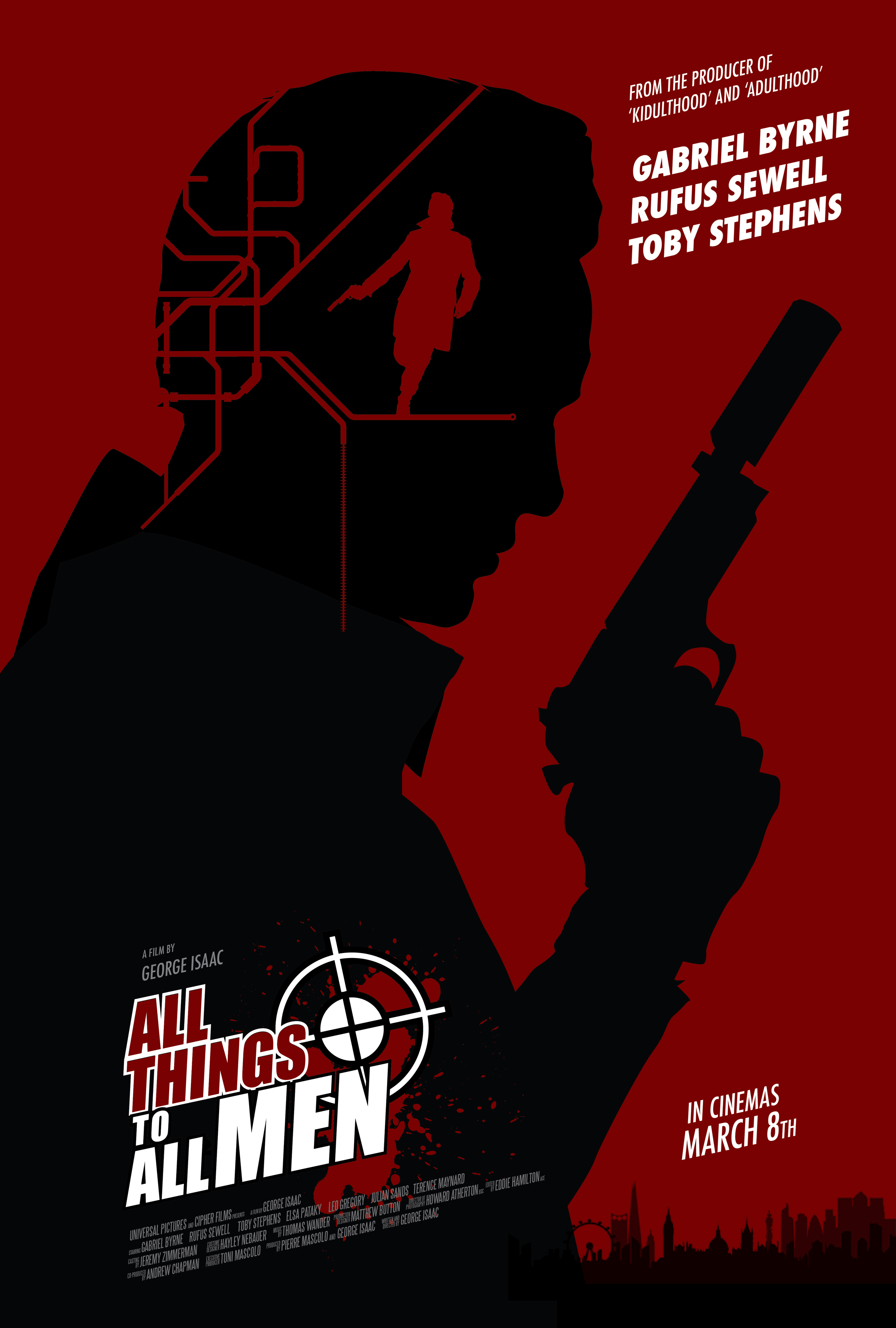
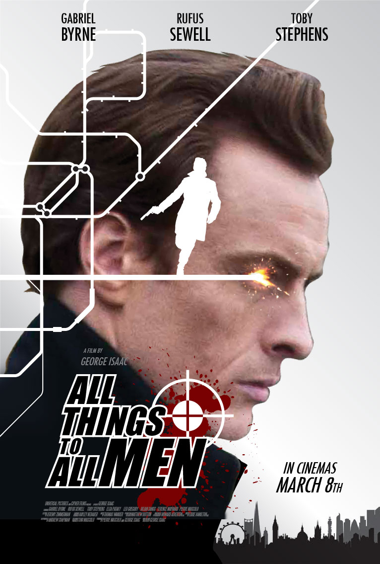
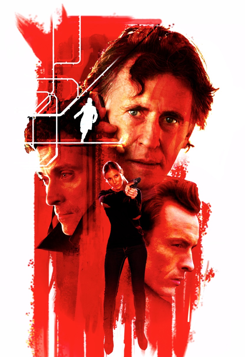
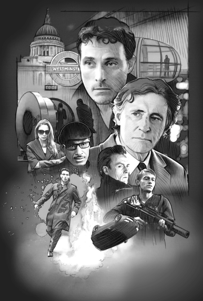
All Things To All Men
Designing and Illustrating a Film Poster.
The project first came about by way of a very nice recommendation from an illustrator friend of mine, Mark Raats to the films Director, George Isaac. Mark was originally connected to the project early on. Having difficulty fitting it in with his workload, he asked me if I could carry on from where he left off.
I jumped at the chance to work on the project, and so it began.
Working directly with George, the Director of the film was a truly great experience and we were able to work out ideas via email and over the phone from his office in London with ease. We spoke almost daily during the project, discussing ideas, ironing out the details, talking films, the industry itself, posters and art... It got to the point where the days we didn't speak, I really missed our chats. George was a great guy to work with and honoured to call him a friend...
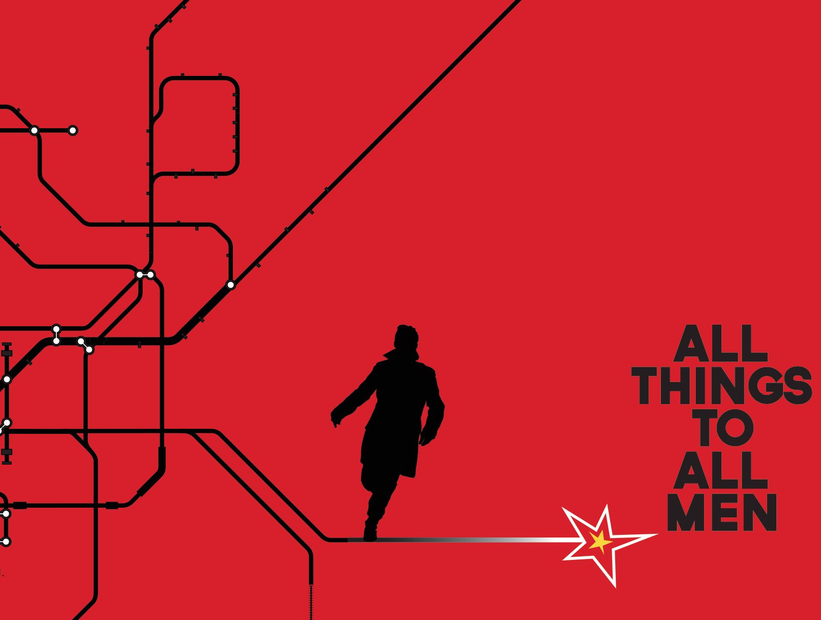
Mark had already created some great concepts for the poster design that everybody loved. Coming to the party a little late, George explained to me he really wanted the poster creating within a pretty tight time frame in order to get the marketing the film started. After working on some updates and revisions to Marks concepts, it was soon obvious that there wasn't going to be enough time to really give this illustrated poster the justice it deserved. I suggested to George that we could create a cool looking teaser poster for the film, get it out there and then concentrate on the main poster after that. George quite liked the idea but was not completely convinced and wanted to see my ideas. So we talked about the essence of the film in depth and the feel he wanted. London was a big part of the film and one of the early tag lines was "Who Lit The Fuse", I had a production photo of Rufus Sewell running in the streets of London that looked particularly strong, it's also one that Mark used in his early concepts. So, I started sketching out ideas and once they were drafted out I emailed them out to George.
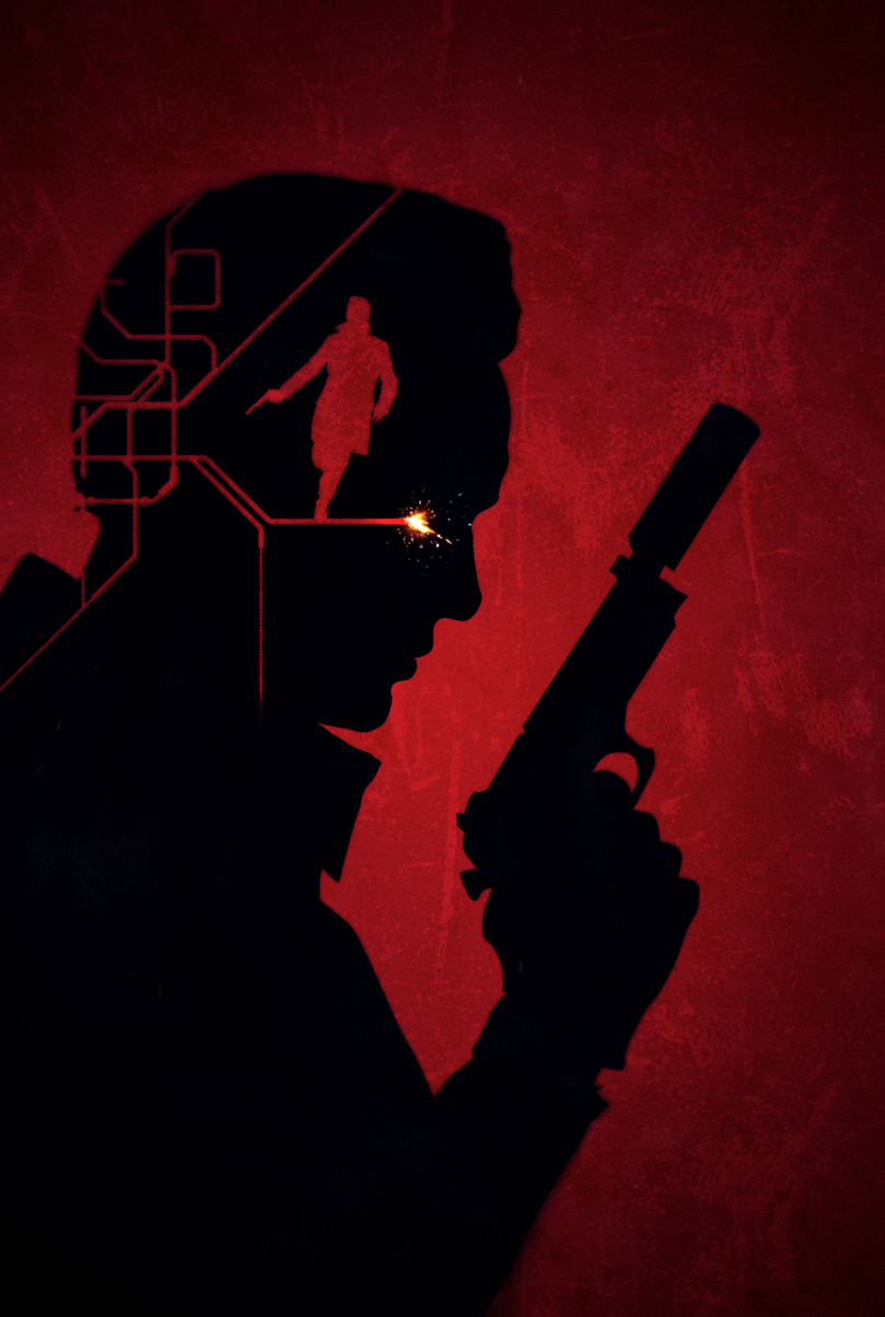
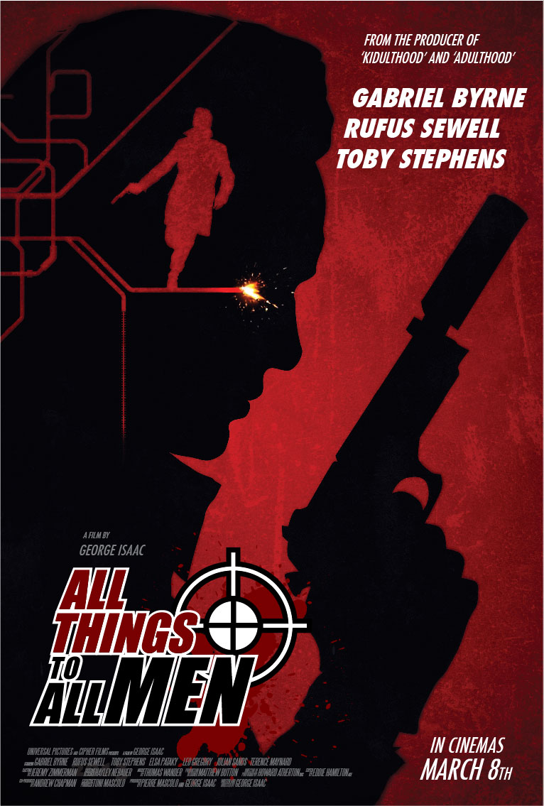
I have always loved the intricacy of the London Underground map and for me it fit perfectly with the twists, turns and complexity of the film. Turning one of the lines into a fuse with a spark and having a silhouetted Rufus running on the fuse line... These 'minimalistic' concepts really resonated with George and there was one in particular that he immediately fell in love with pretty much deciding there and then that this was going to be the MAIN poster for his movie! I was a little taken aback by that! what no fully illustrated poster now!?...
I redesigned the film's title logo and I created the artwork in various formations needed for the advertising of the film. The One Sheet/Roadside Outdoor Poster, A British Quad for the cinemas, a 96 Sheet backlit billboard and the T Side for the London buses.
After the final artwork was approved and set in motion for the advertising campaign I decided to revisit the original illustrated concepts for the poster and created this fully illustrated version of the poster, primarily as a thank you gift to George and Mark for their sheer awesomeness and to also satisfy my own desire to see the job completed... I think it serves as a nice companion piece to the Red Poster design fleshing out the excitement of the film and it's characters.
Creating artwork (key art) for the advertising of a film in cinemas has always been a high on the personal goals list for me and despite creating a one sheet illustration for Daryl Goldberg's 'Made For Each Other' in 2008 and the film related personal / gallery work I have been producing, this project ticked one of my boxes for sure. With a major advertising push by the Director George Isaac and Producers of the film meant it has made it's way around the UK in a big way over the last couple of weeks. Living in New Zealand, I haven't been able to see the posters first hand but thanks to my friends and fans I have been able to see it in their snaps of ATTAM poster sightings around the UK on Bus Shelters, in the London Underground, sides of double decker buses... I'm just waiting on a photo of the huge 96 sheet backlit billboard that went up last weekend!
Unused Poster Concepts
Check out the trailer
All Things To All Men was released in cinemas across the UK on April 5th Starring Gabriel Byrne, Rufus Sewell and Toby Stephens.