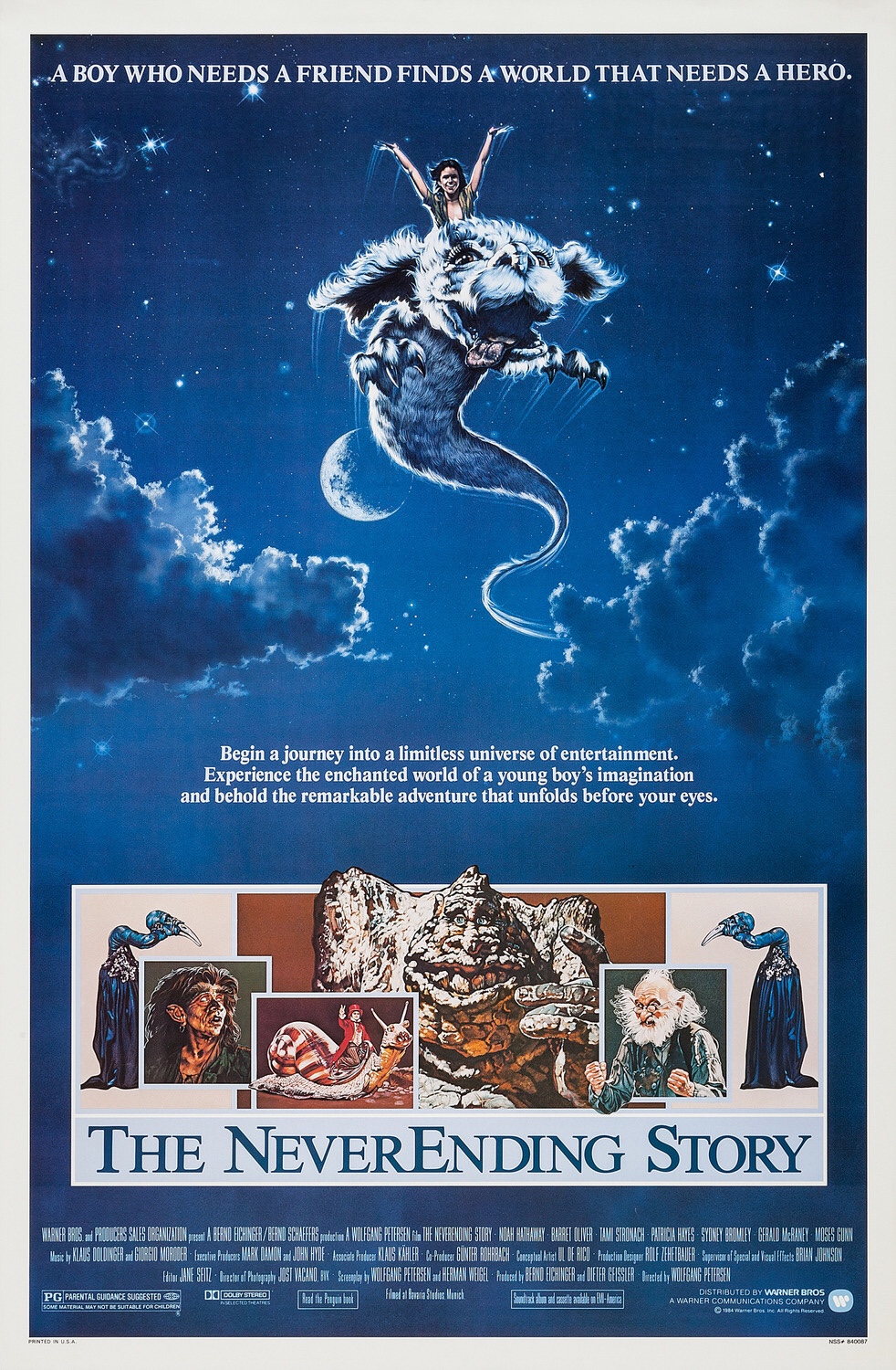
Warner Bros. 1984 original one sheet movie poster. Illustrated by Richard Hescox.
Every time it comes for me to sit down and reflect on movies and movie poster art I hesitate before glancing overwhelmingly within my mind over so many movies and memories. But, I quickly think of movie poster art and find my hasty browse slow to a reflective gradual halt. In this instance, my focus soon stopped and reflected on the image of Falkor, a mythical Luck Dragon from The Neverending Story.
Based on the novel by Michael Ende, The Neverending Story (1984) promised a tale of fantasy. Directed by Wolfgang Petersen, the German production was mainly filmed in Munich, and, at the time, was the most expensive film outside of US production. The cast included Noah Hathaway (Atreyu), Barret Oliver (Bastian), Tami Stronach (Empress), Patricia Hayes (Urgl), Sydney Bromley (Engywook), Gerald McRaney (Mr. Bux), Moses Gunn (Cairon), Alan Oppenheimer (Falkor), Deep Roy and many others.
Artist and illustrator Richard Hescox created The Neverending Story’s illustrated one sheet movie poster that would grace the cinemas and frame many childhoods. The flying Falkor and Atreyu are painting soaring amongst the clouds with fellow cast members lining the bottom suggesting an epic and fantasy driven adventure. A traditional artist, Richard Hescox has worked on other entertainment campaigns such as E.T., The Dark Crystal and illustrations for a series of George R.R. Martin’s Game of Thrones. He continues to make original art pieces of imaginative themes and landscapes of fantasy.
In an October 13, 2013 interview with TheOriginalVanGoghsEarAnthology, Richard Hescox spoke about his art, inspiration and philosophies of illustrating where he reflects on the question of art as a powerful force:
“I like to think of art (all branches: literature, poetry, song, drama, music, sculpture, painting, etc…) as Hyper communication. Talking is basic communication. But make those words a poem and the concept embeds itself far more effectively in the listener. Graphic arts do the same. A talented artist can communicate a concept more subtly, and at the same time more powerfully to the viewer. The mark of good art is the amount and quality of communication that it effects (a test that too much modern art fails at).” -Richard Hescox (Interview 2013, TheOriginalVanGoghsEarAnthology)
Though the author of the original novel The Neverending Story felt that the movie did not reflect his book in its entirety, it has, nonetheless, made an impact over the many decades since its release 35 years ago. In 1990 my 2nd grade teacher scheduled a movie day at school where we could bring a sleeping bag and watch a movie, and on this occasion it was The Neverending Story. This one moment was instantly enmeshed with the events around me that year, friends, moving, changing schools twice and the magic of Falkor. The art of film and movie posters are powerful forces. The importance of the illustrated movie poster is the imaginative power of the artist and relaying this to a receptive audience, a freedom to create an image of fantasy and showcase the film in one image. However, it is the impact of their art that can remain impressionable and is often our reference point in memory.
“I feel the most pleasure when I find that a painting I have done, and which I feel a huge aesthetic charge from, has also touched others in unexpected ways. The communication I strive for has to be felt by viewers of my paintings on a deeper than literal level. Therefore I am most excited about creating the next painting that achieves that.” -Richard Hescox (Interview 2013, TheOriginalVanGoghsEarAnthology)